Material ledger / Finish & colour
Light changes everything
A surface can be easy to wipe yet quick to show droplets. Another can hide reflections but hold dirt in its texture. Appearance and suitability need separate decisions.
04 / Test light and colourA showroom sample is seen under lighting chosen for a display, not necessarily for your home. Take the same tile to a window, beneath a warm lamp and into the room where it will be installed. Its undertone, variation and reflectivity may become noticeably different.
Finish names are not precise performance classes. “Matte,” “satin,” “silk” and “natural” can describe different surfaces across manufacturers. Use these labels to begin a visual comparison, then ask for the exact technical data and cleaning instructions. Do not infer wet-floor suitability from a soft-looking finish.
Matte, satin and polished: compare what becomes visible
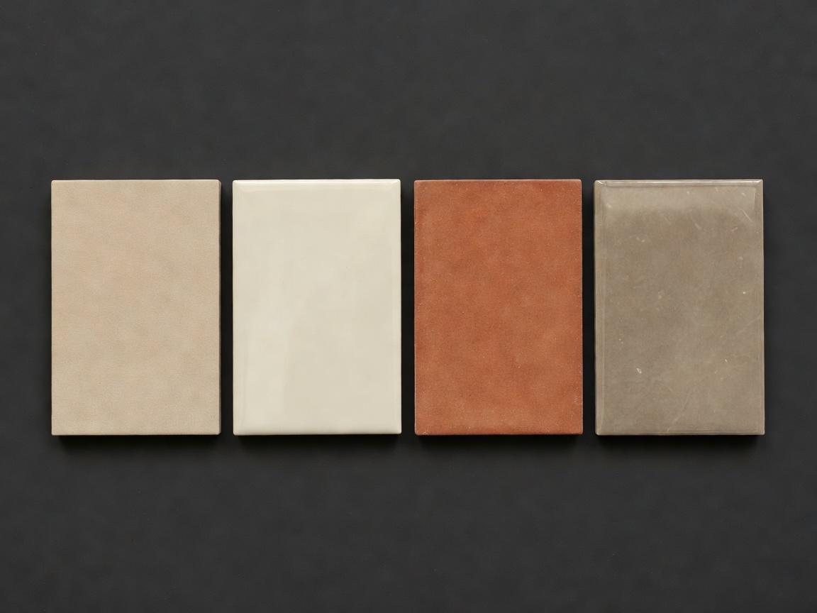
Matte finishes scatter reflected light and can reduce the sharpness of glare. This can suit rooms with strong daylight or multiple light sources. A matte face is not automatically easy to clean, however. Microscopic surface texture and a more pronounced relief can affect how readily grease or residue releases.
Satin finishes sit between diffuse and sharply reflective appearances, but the category is broad. Examine the actual sample from a low angle. Some satin surfaces show gentle streaks after wiping, while others mask them reasonably well. A practical cleaning test tells you more than the descriptive label.
Polished and glossy faces produce clearer reflections. On walls, that can create depth and a lively response to light. The same reflections can highlight water spots, fingerprints, adhesive-related irregularities or uneven edges. Polished stone and glazed ceramic also reach their shine through different processes and may need different care.
Low reflected definition
Soft reflected definition
Sharper reflected definition
Illustrative swatches compare appearance only, not friction or durability.
Texture: balance touch, soil and access
A structured tile can break up a large wall and produce changing shadows through the day. On a feature wall, those shadows may be the main attraction. Behind a hob, the same ridges can create extra work because greasy deposits collect along recesses that a flat cloth does not reach easily.
Floor texture needs a similarly balanced assessment. More texture can influence traction, but slip risk depends on the specific surface, contaminants, footwear, drainage and maintenance. An unsuitable cleaner can leave residue and change the conditions underfoot. Texture alone is not a reliable safety specification.
Ask for test information applicable to the intended use. ANSI A326.3, EN 16165 and other methods address particular test conditions; their results are not universally interchangeable. Where needed, involve a suitably qualified specifier to interpret the evidence and local requirements rather than comparing unrelated numbers.
Colour combinations: decide what should lead
A restrained combination of warm white, sand and charcoal can let geometry carry the design. Terracotta with cream can place more emphasis on warmth and material variation. Deep green with a pale neutral can create a strong feature without requiring several competing patterns. The useful question is not which pairing is fashionable, but which element should remain visually dominant.
Place tile beside the actual cabinet door, worktop, paint and metal finish. Two neutrals that look similar separately may reveal incompatible undertones together. Samples viewed vertically can also seem different from the same samples laid flat because they receive and reflect light differently.
Use a large enough sample to show shade variation. Stone, handmade-look ceramic and printed porcelain may be intentionally varied; one piece cannot represent the whole field. Ask how many face designs or variation ranges exist and how installers should blend the boxes.
Grout colour: control the network
A close grout match can make small pieces read as a larger field. Contrasting grout outlines each piece and emphasizes pattern, but it also exposes uneven spacing and visible sheet boundaries. Neither strategy conceals poor setting out.
Light grout may show dark soil, while dark grout can show pale mineral deposits or cleaning residue. Actual behaviour depends on the grout type, exposure and maintenance. A printed colour chart is only a starting point; approve a cured sample with the tile because joint depth, lighting and product variation affect the result.
Joint width should follow the tile characteristics and installation requirements, not just the wish for an almost invisible line. Rectified edges do not justify butting tiles together. Movement joints also have a different role and should not be removed to make the pattern seem continuous.
Approve the sample in the room
Build or request a small grouted panel using the proposed materials. View it at the distance from which the room is usually seen, then inspect it close up. Use daylight and the planned evening lighting, particularly under-cabinet strips or wall washers that produce raking light.
Keep the approved panel and written product details until the work is complete. Compare deliveries before installation, allowing for the declared variation rather than expecting every piece to be identical. A measured approval process is less costly than discovering that a beautiful loose tile becomes too reflective, too busy or too difficult to maintain across an entire room.